
A design system for a jet-fuel marketplace
I built FuelerLinx's internal design system, then structured it so my team and AI coding tools could build new screens from it without breaking design or accessibility standards.
- Role
- Sole UX owner, with embedded front-end work
- Timeline
- Feb 2024 to Aug 2026
- Team
- Engineers, product manager, and mobile developer
- Stack
- Blazor WebAssembly (.NET 9), Razor, Radzen.Blazor, Material Design, Figma, Claude Code, Claude Design
- Scope
- Web product modules; patterns reused in the marketing website along with the mobile companion app
- Result
- WCAG AA by default in every component and accessibility across the web and mobile applications
Problem
FuelerLinx is corporate aviation's largest jet-fuel marketplace: $3.2B+ in annual transactions, 120,000+ monthly dispatches, and 5,000+ aircraft. The people using it are doing operational work, often under time pressure, so a screen that behaves differently from the last one costs them real minutes.
When I joined, the product was built on Radzen.Blazor components, with Material Design patterns in use alongside them. I was the only UX person, so the system had to hold up without me standing over every screen.
Role
I owned the system end to end: deciding what belonged in it, designing the components in Figma, building them in Razor and Radzen, and writing the AI workflows that used them.
Process
Start from what already existed
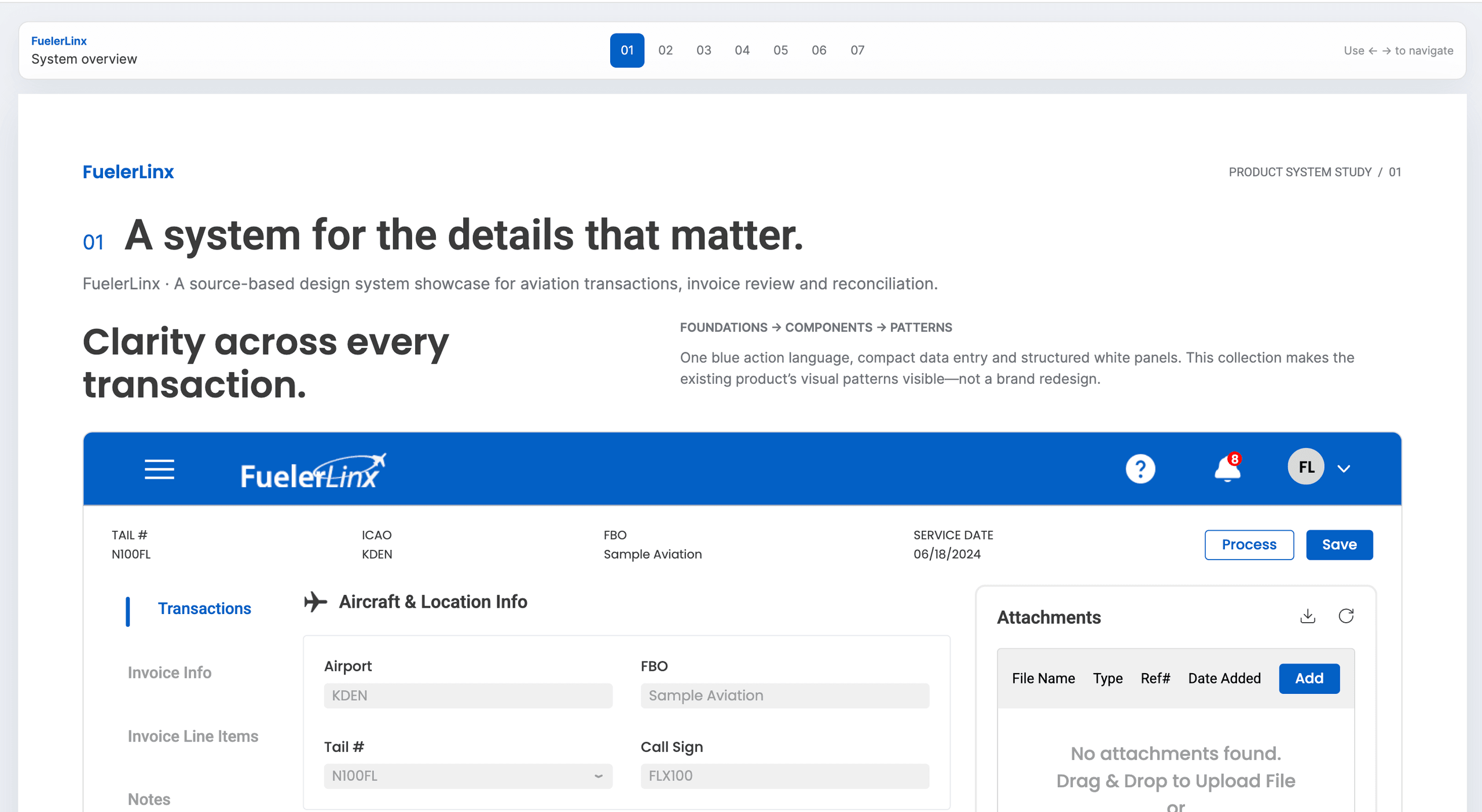
The product already used Radzen.Blazor with Material Design patterns. I didn't replace that. I combined the two into one internal library so modules pulled from a single source instead of each making their own choices.
Name things so they can be assembled
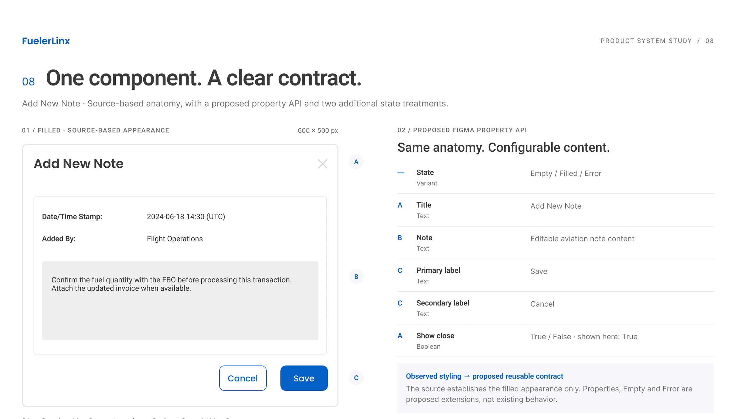
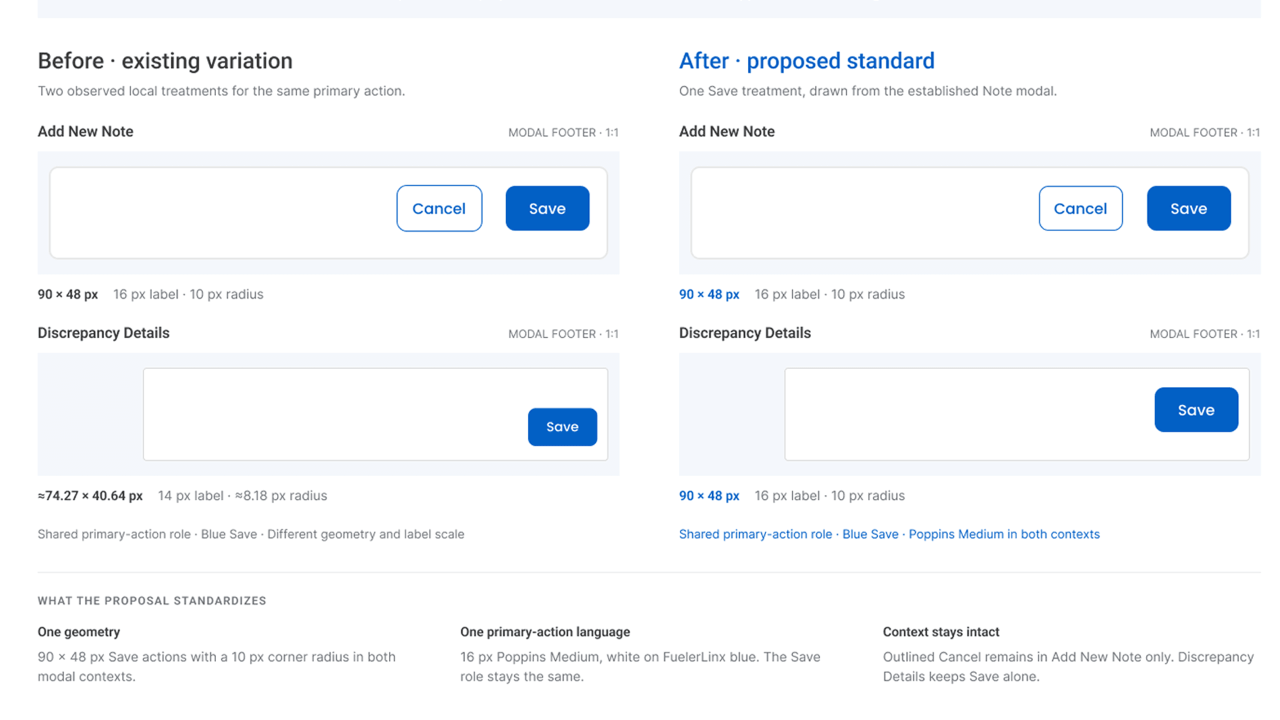
I structured component names, props, and patterns deliberately so engineers, and LLM coding tools, could assemble new views reliably from Figma.
Put accessibility in the component
I checked legibility, contrast, and microcopy during design, then built those checks into the reusable components, so every component met WCAG AA from the start. That let the team hold the standard without me.
Bring in AI, with guardrails
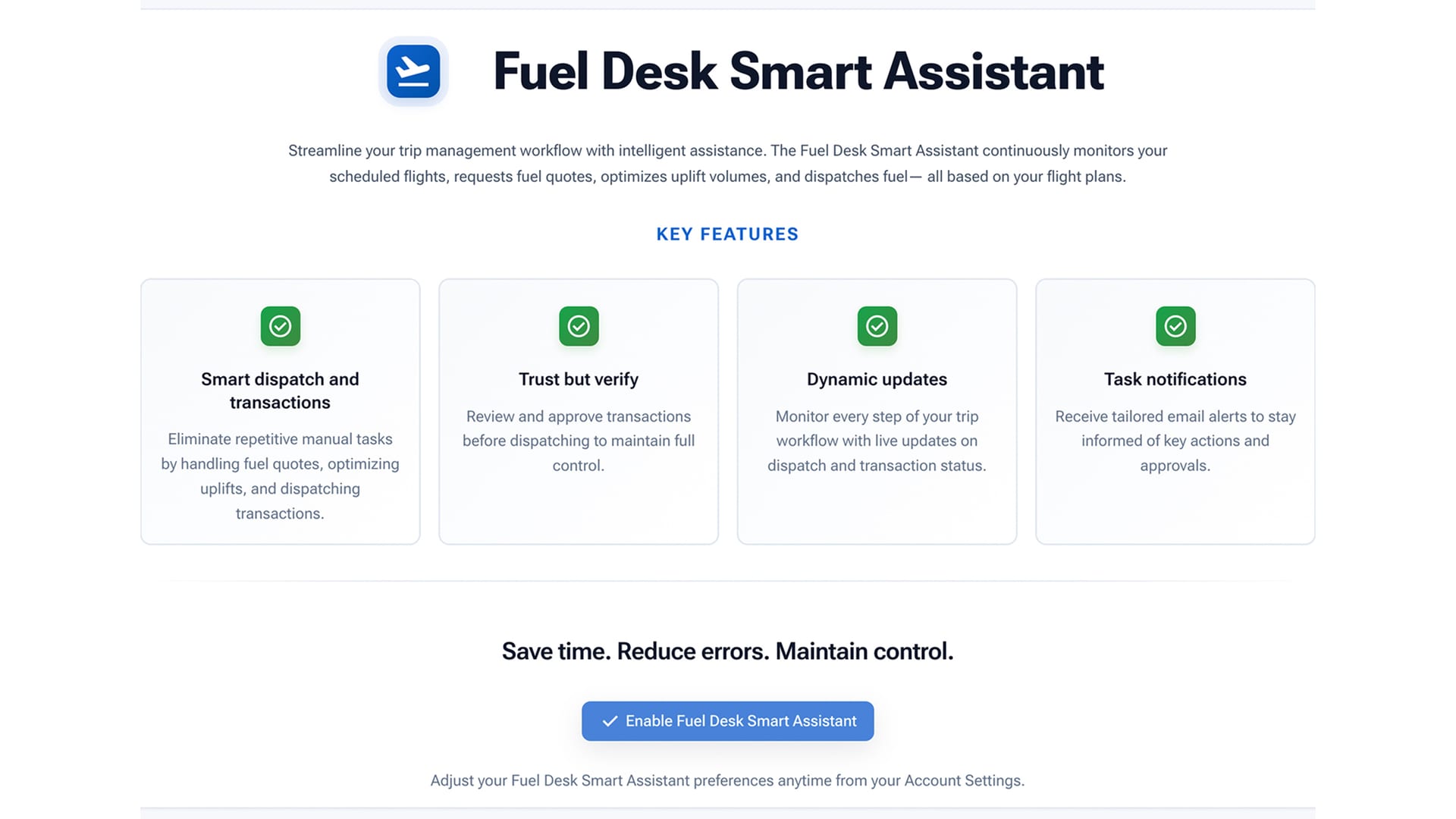
I wrote custom UI/UX skills and agents in Claude Code that carry approved Figma designs into production front-end. Because the components were named and structured for it, the agents could assemble new views from the library instead of inventing markup. I also used Claude Design to develop an additional component library and high-fidelity mockups the team reviewed before anything was built.
Solution
The system has three parts that work together, with the AI workflow on top.
One shared library
Radzen.Blazor and Material components combined into a single internal set of components and patterns.
Names that mean something
Names and props that match in Figma and Razor, so engineers could find the right component by name.
Accessibility built in
Contrast, legibility, and microcopy checks live in the components.
Where it showed up
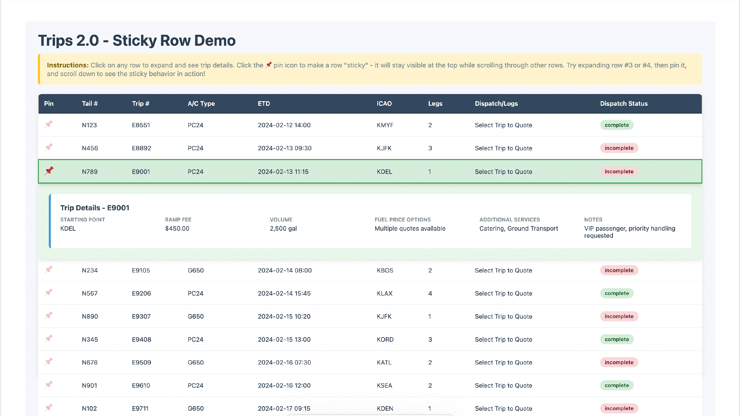
- Trips 2.0A real-time operations dashboard for trip dispatch, leg tracking, fuel optimization, and financial workflows. Average dispatch time dropped 60%. Read the case study
- TransactionsRedesigned across three major versions (2.0 to 3.1). Patterns from it, including inline filtering and discrepancy handling, were reused in later modules.
- Website 2.0I led the redesign and updated the Figma design system. Average session length rose 75% and page load times dropped about 80%.
- Mobile app (.NET MAUI)I led information architecture, flows, and interface design with one engineer. Version 2.0 shipped six major features in six months, 27+ scheduling-system integrations, and a 4.4-star App Store rating.
Those figures belong to the projects, not to the design system alone. They show where the system was used, not that it caused them.