
FuelerLinx mobile 2.0: six features in six months
I led information architecture, flows, and interface design for the FuelerLinx mobile app, working with one engineer. Version 2.0 shipped six major features in six months.
- Role
- Led information architecture, flows, and interface design, working with one mobile developer.
- Timeline
- 2024-2026
- Team
- Mobile developer, stakeholders, product manager
- Stack
- Figma, .NET MAUI (iOS)
- Users
- Dispatchers and pilots
- Result
- Six major features in six months, 27+ scheduling-system integrations, 4.4-star App Store rating
Problem
FuelerLinx is corporate aviation's largest jet-fuel marketplace: $3.2B+ in annual transactions, 120,000+ monthly dispatches, and 5,000+ aircraft.
Role
I led information architecture, flows, and interface design, with one engineer building it in .NET MAUI.
Process
Information architecture and flows
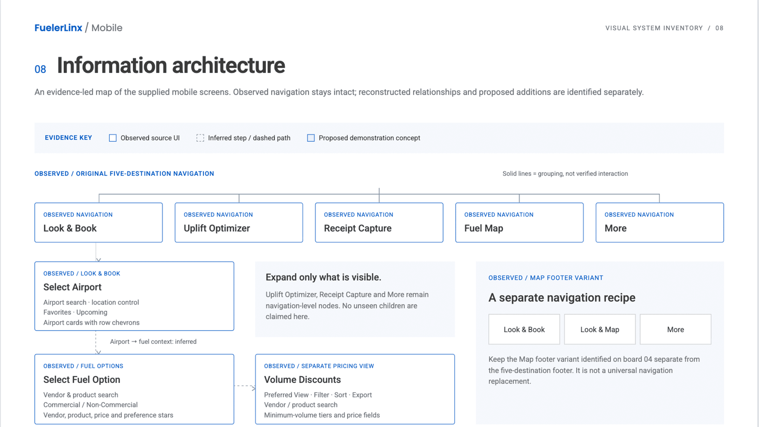
The web app shows everything at a glance: transactions, analytics, scheduling, and more. That's built for a flight department's accounting and dispatch teams. The mobile app has a smaller job. Early on I set one rule: include only what pilots need, and leave the rest on the web.
I left the whole transactions section out of the app, because it doesn't apply here. If anything, I added receipt capture, so pilots can capture a receipt or invoice before their flight and keep it on file in the web application.
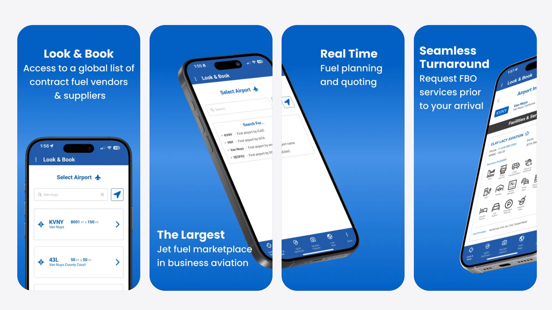
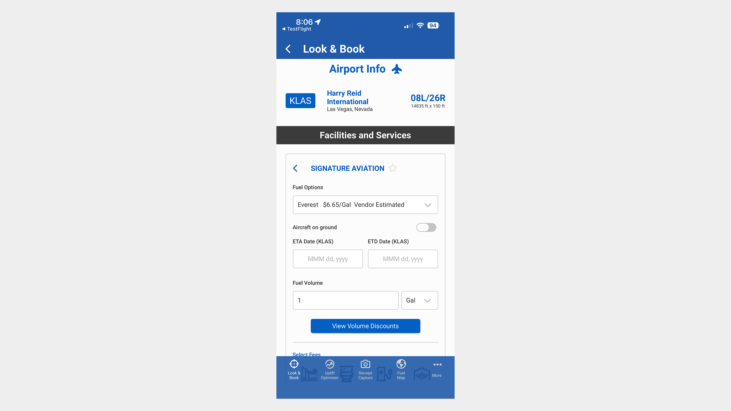
Look & Book was the one feature I treated as essential. Pilots and other crew can search by radius or along a flight path and get the best fuel stops, plus the services a private flight department needs for upcoming trips.
They can summarize what they find and keep it saved in the app.
When I redesigned the app, I took a deep dive into which devices the departments use most and made sure the UI and features would work well on them. Pilots have so many flights and so little time between them that the app needs the essentials for quick tasks, not the whole web flow.
We surveyed users about how they were using the app. Most of them were on phones, because the app was having issues on tablets.
Receipt capture was one of the most requested features, so we knew right away it belonged on the phone. A lot of departments had a phone with them on the ramp while they waited.
Six features in six months
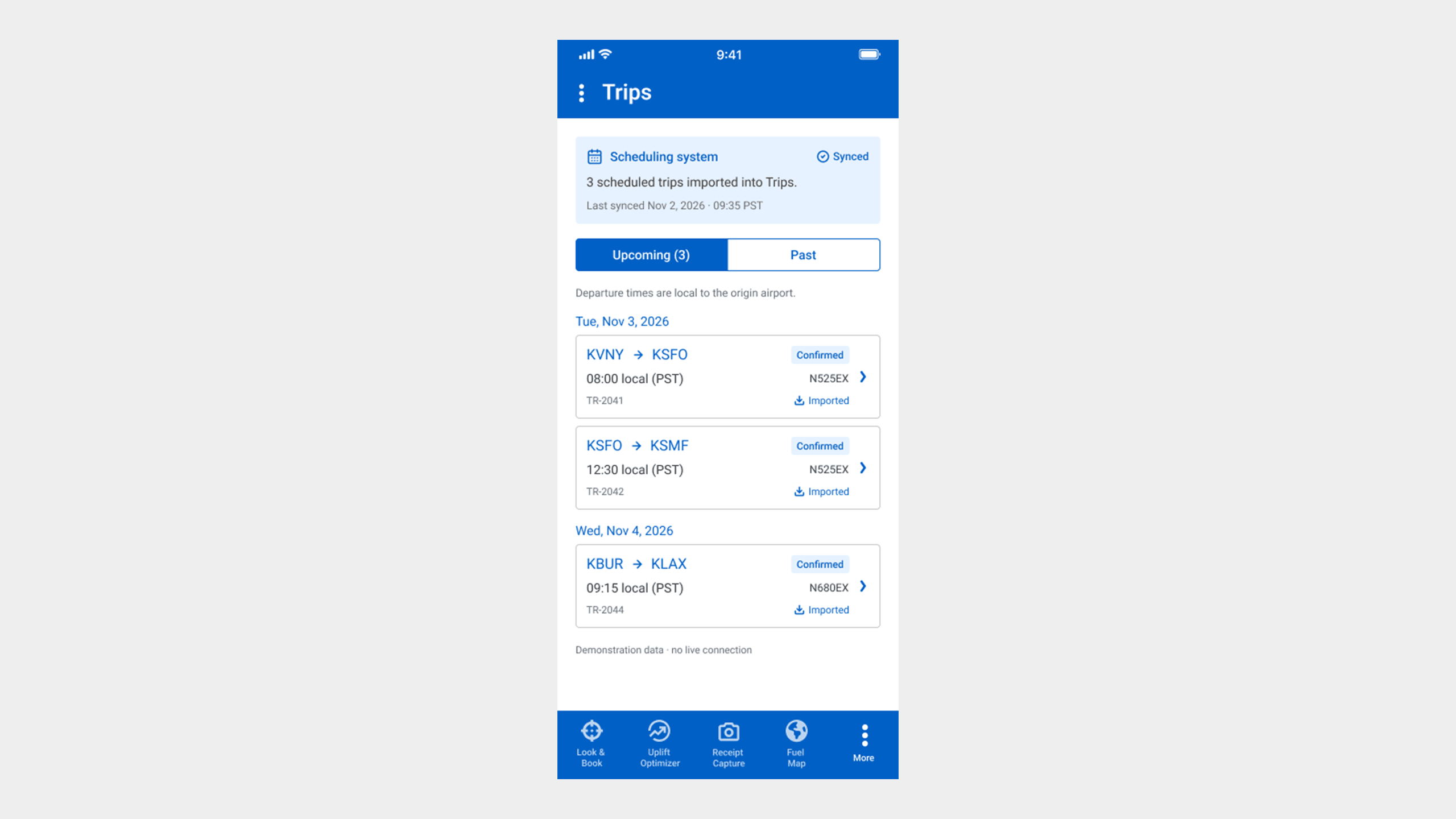
Version 2.0 shipped six major features in six months, including 27+ scheduling-system integrations.
My mobile developer and I went through the redesign roadmap together and planned each sprint's features from the interviews, support tickets, and stakeholder feedback.
I had most of the designs and components planned already, but the rollout still needed care. Some features were for military users, and we had to meet many of their app development standards. All of this was phase one, which ran six months.
During the redesign I designed some of the most important features myself. Look & Book was the essential lookup tool. Receipt capture changed how pilots handle invoices and receipts for their scheduled trips: they can capture several at a time and upload the batch at the end of the day.
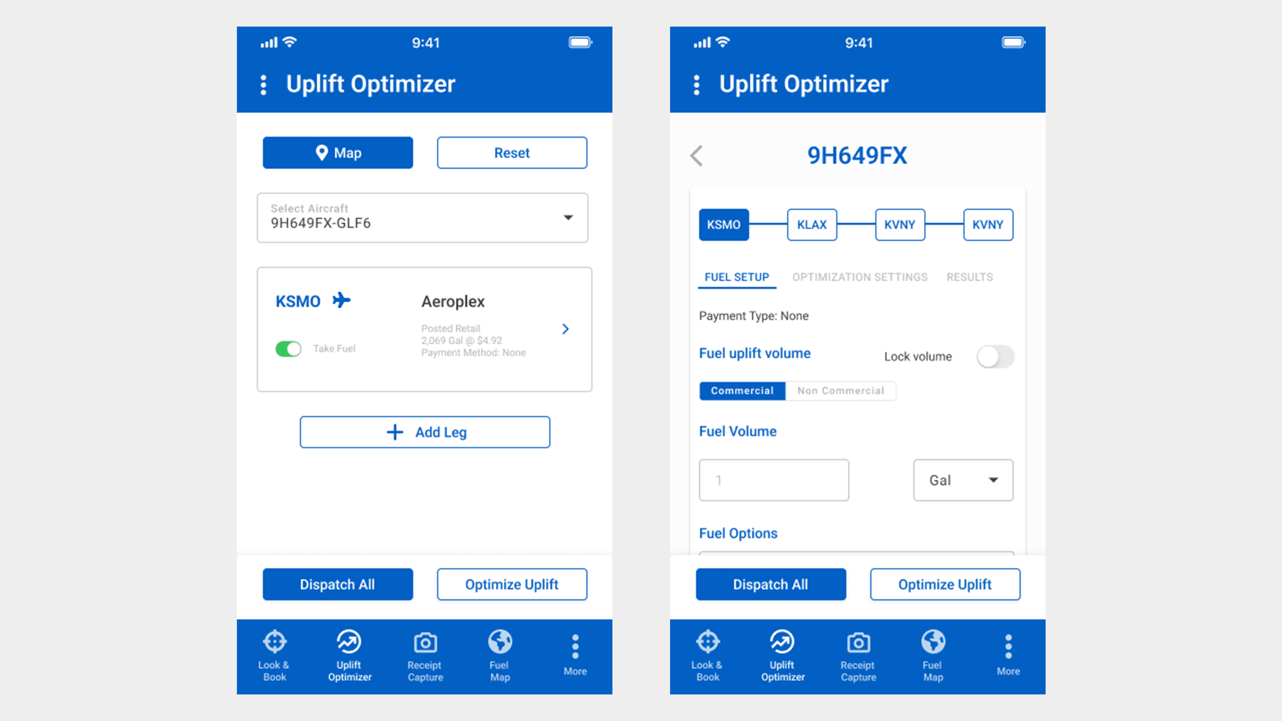
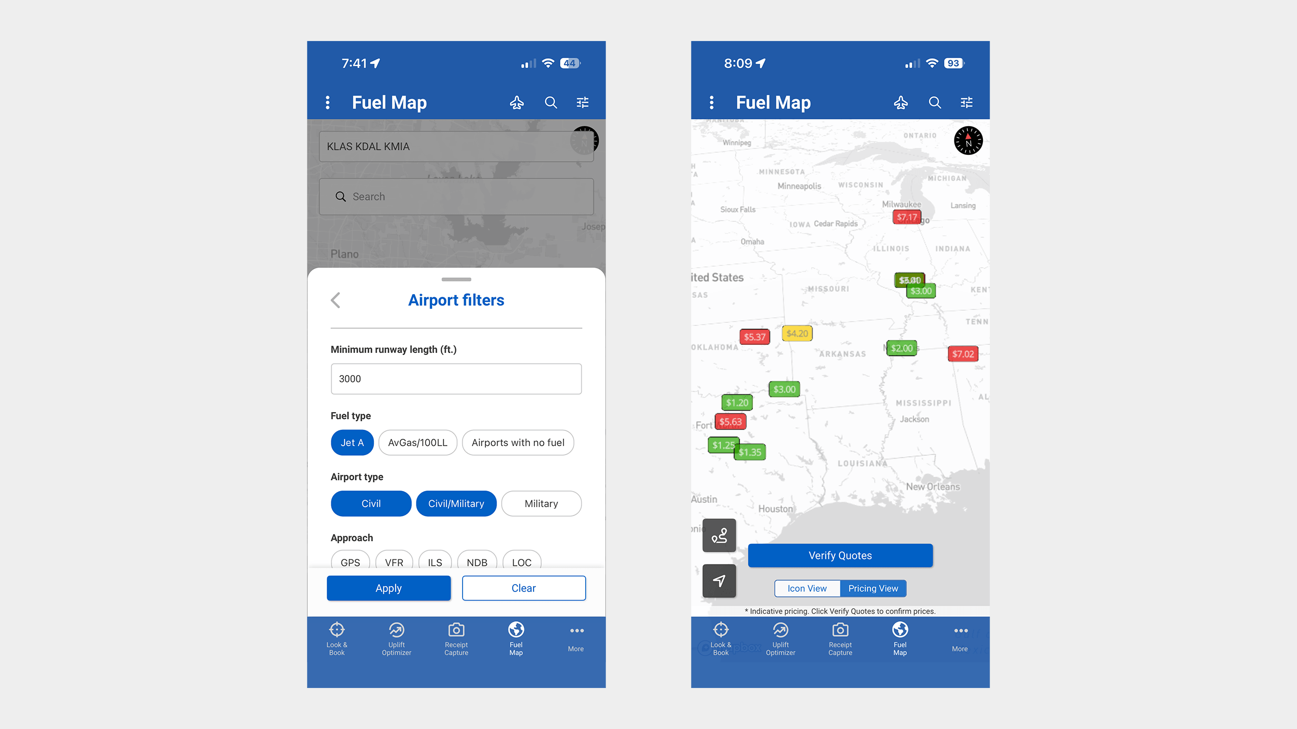
While building these, the team and I decided to add more features that would help pilots. We expanded Look & Book with service add-ons for FBOs, including pricing. We added the uplift optimizer, which calculates the best fuel price options. We also improved the fuel map, which works as a flight map and shows the best FBO fuel prices for each route.
Design
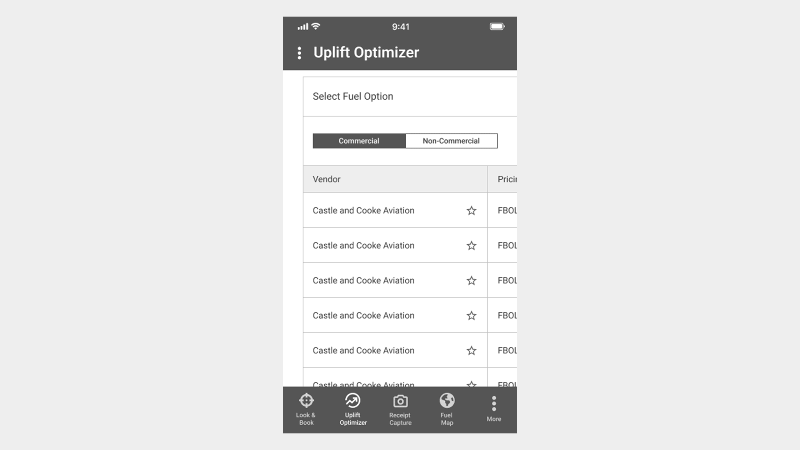
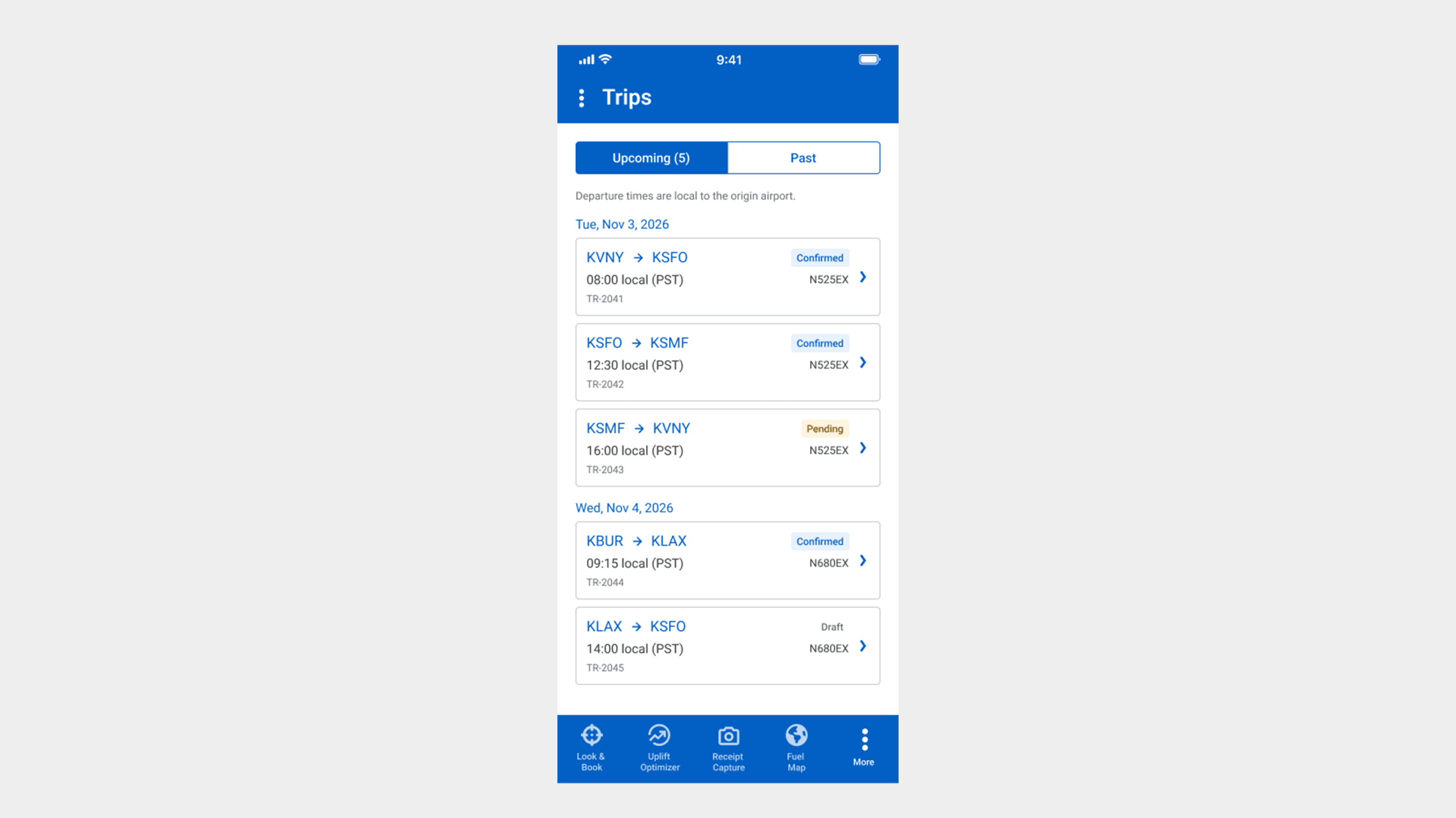
The challenge was making the data-heavy trip information the main feature. The legacy app had that view, but it wasn't user friendly across all devices. I knew a data grid would suit a tablet, but not every phone.
Mobile and the design system
The mobile app is part of the same system as the FuelerLinx web application, not a separate product. The two are built differently, but they are tied together underneath.
Solution
Version 2.0 shipped six major features and 27+ scheduling-system integrations. The six features were Look & Book, receipt capture, FBO service add-ons with pricing, the uplift optimizer, the improved fuel map, and multi-trip setup.
Outcome
We had a successful launch. The App Store reviews tell the rest, with a 4.4-star overall rating.
What I'd change
With more time on the mobile app, I would change a few things.