← All workCase study · FuelerLinx · Web

Rebuilding the FuelerLinx website for performance

I led the redesign of the FuelerLinx marketing website and updated the Figma design system and information architecture. Average session length rose 75% and page load times dropped about 80%.

Role
Led the redesign, and updated the Figma design system and information architecture.
Timeline
2026
Team
Stakeholders and customer support team
Stack
Figma, HTML, CSS, JS
Audience
Buyers, operators, vendors
Result
Session length +75%, page load times about −80%
01

Problem

FuelerLinx is corporate aviation's largest jet-fuel marketplace. Website 2.0 is the redesign of its marketing website.

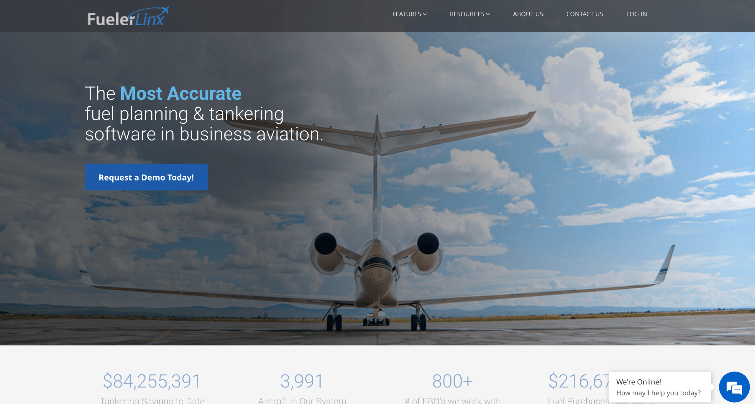
The site was still from 2017, and it no longer matched how big the product had become.

02

Role

I led the redesign and updated the Figma design system and information architecture.

03

Process

Information architecture

The old site buried its pages in sub pages and sections. The stakeholders and I reviewed all the content and marked what was less important to show, or could be combined into smaller sections. The old site had too much depth, with a page for everything.

A shared Figma system

I updated the Figma design system so the site used the same components and patterns as the product.
The FuelerLinx Solutions section, headed "Built for Every Aviation Professional", with a row of cards for Dispatchers, Pilots, Accountants, and Flight Managers. Each card has a plus button to expand it.
The Solutions cards, using the same carousel as the Transactions and Trips info cards

Design

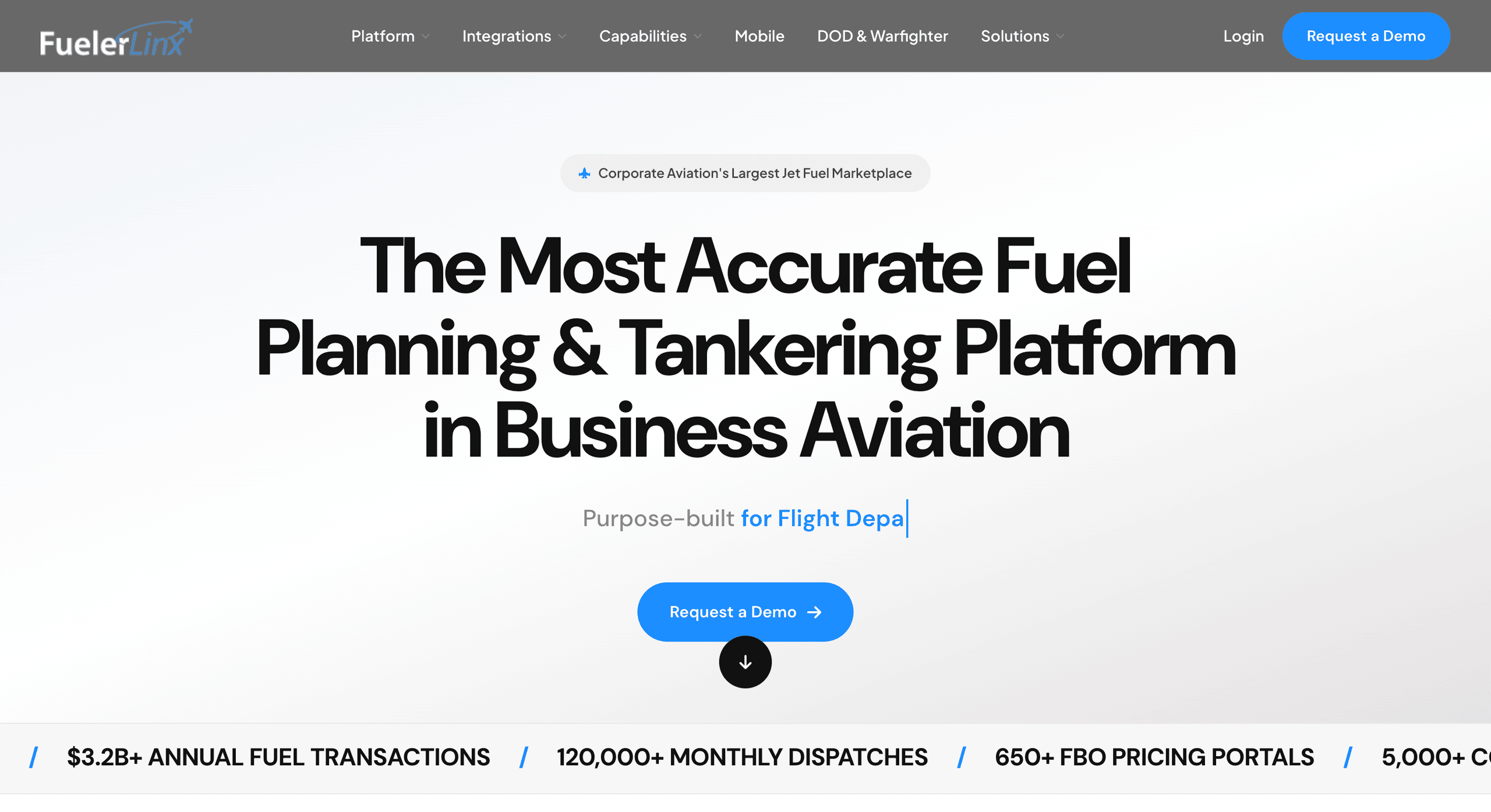
An explored FuelerLinx homepage on a light background, with the headline "The Most Accurate Fuel Planning & Tankering Platform in Business Aviation", a Request a Demo button, and a scrolling row of key figures.
Rejected: a light hero
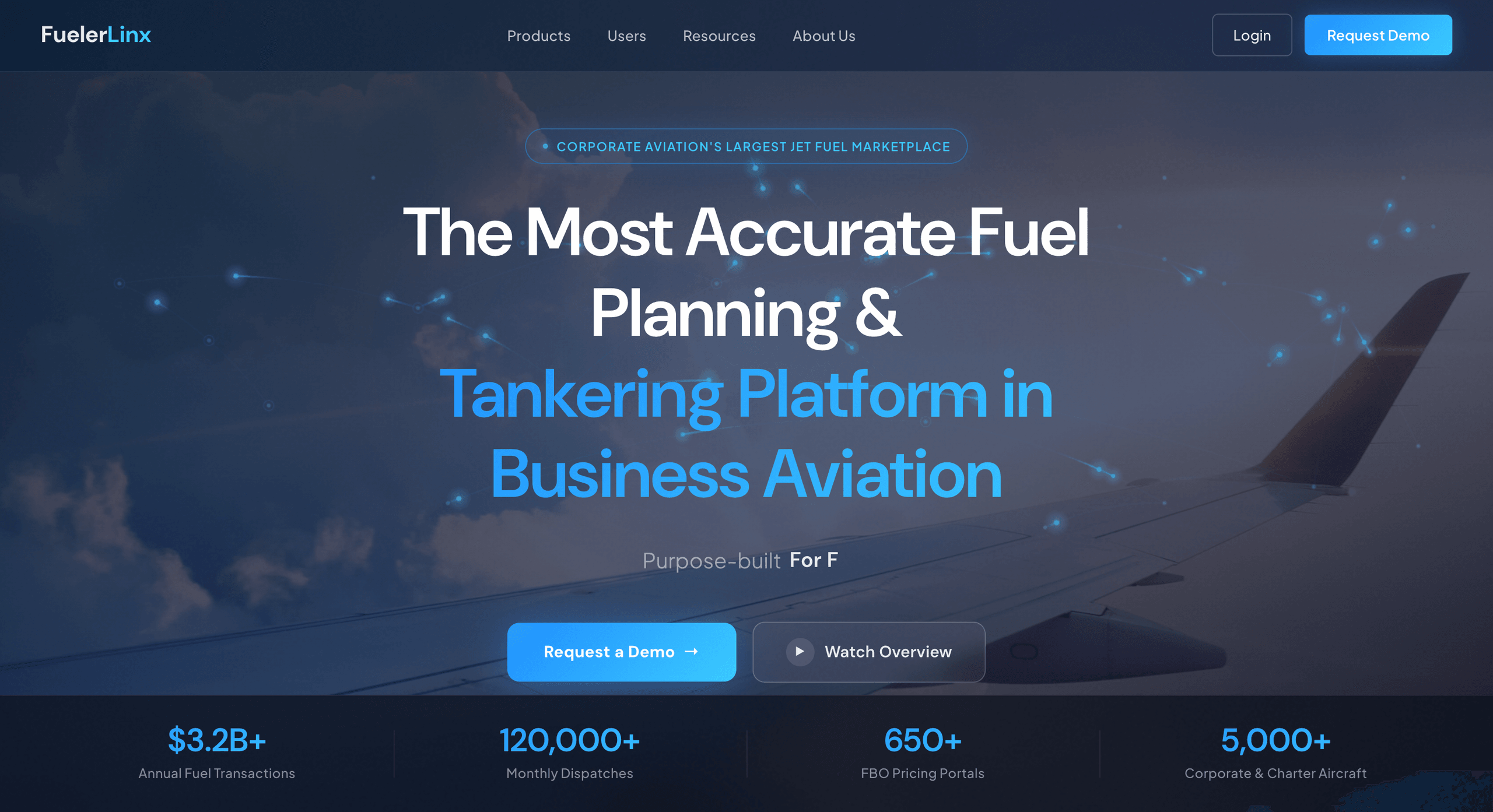
A rejected FuelerLinx homepage direction with a blue-tinted aircraft wing photo, the headline "The Most Accurate Fuel Planning & Tankering Platform in Business Aviation", and two buttons.
Rejected: a wing photo hero

Speed

04

Solution

Website 2.0 is the redesigned marketing site, built on the updated Figma design system and information architecture. Page load times dropped about 80%.
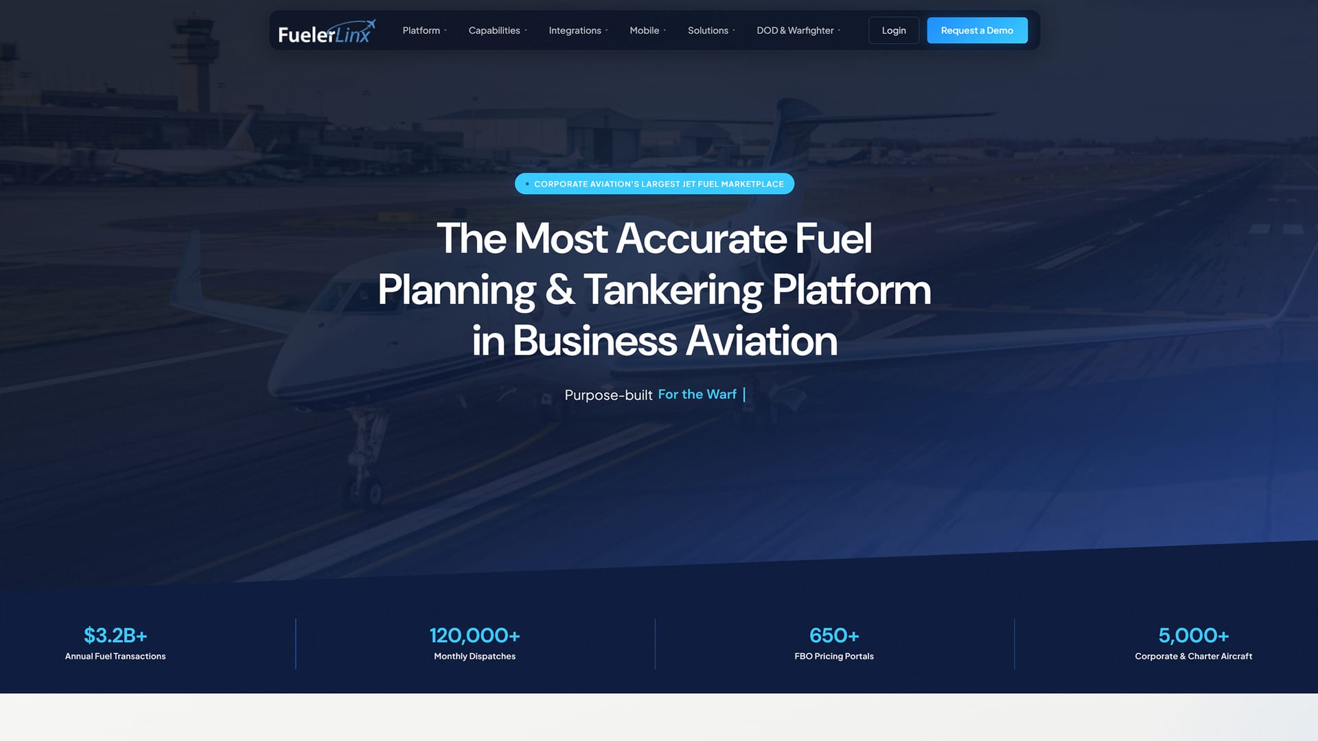
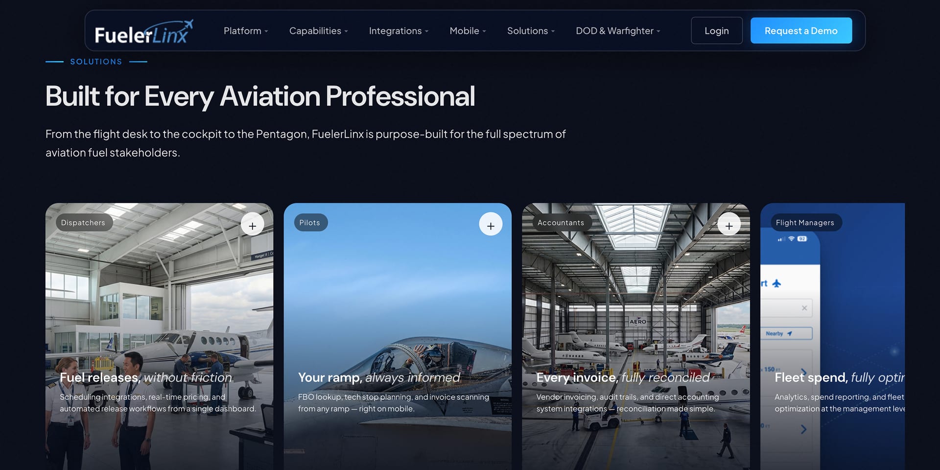
The FuelerLinx homepage above the fold: a navigation bar with Platform, Capabilities, Integrations, Mobile, Solutions, DOD and Warfighter, Login, and a Request a Demo button, over a photo of a business jet on a taxiway. The headline reads The Most Accurate Fuel Planning and Tankering Platform in Business Aviation. A row of four company figures sits below the hero.
Homepage: the headline, a Request a Demo button, and key numbers above the fold
The Solutions section of the FuelerLinx homepage on a dark background, headed Built for Every Aviation Professional. A row of cards, one for each audience: Dispatchers, Pilots, Accountants, and Flight Managers. Each card has a photo, a short headline, a line of description, and a plus button to expand it. The fourth card is cut off at the right edge.
Solutions: a card for each audience, from dispatchers to flight managers
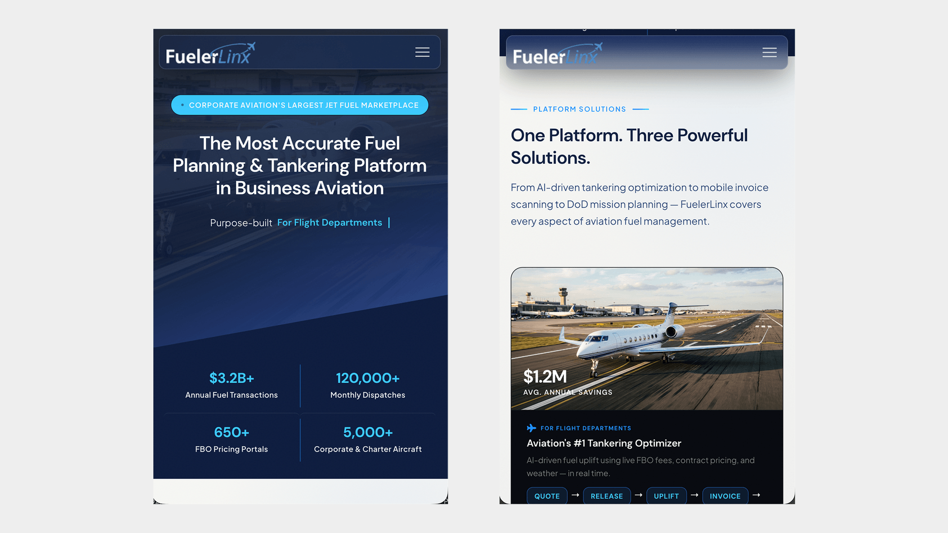
Two phone screens of the FuelerLinx homepage. Left: a compact navigation bar with a menu button, the headline The Most Accurate Fuel Planning and Tankering Platform in Business Aviation, and four company figures in a two by two grid. Right: the Platform Solutions section, headed One Platform. Three Powerful Solutions, with a card for flight departments showing a jet photo and a Quote, Release, Uplift, Invoice flow.
Mobile view: the homepage on a phone, with the headline and figures stacked in one column
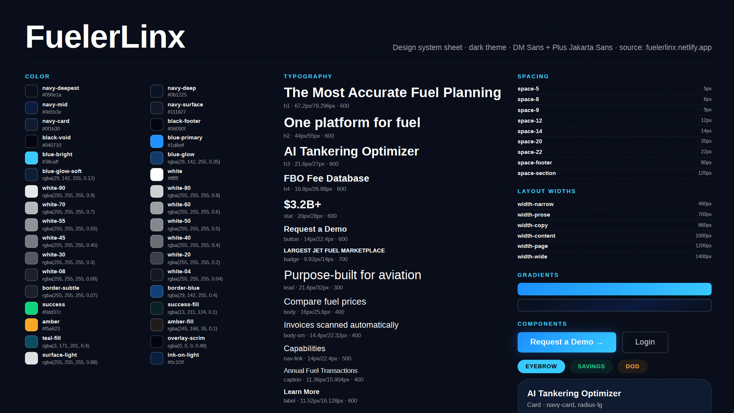
A FuelerLinx design system sheet on a dark background, in three columns. Color: a list of named swatches such as navy, blue, white at different opacities, success, and amber, each with its value. Typography: headings from h1 to h4, a stat style, button, badge, lead, body, and caption styles, each with size and weight. Spacing, layout widths, and gradients, then components: a Request a Demo button, a Login button, three badges, and a card.
Design system sheet: color, typography, spacing, layout widths, gradients, and components for the dark theme
05

Outcome

+75%average session length, with page load times down about 80%
06

What I'd change