
← All workCase study · The Lounge at Lodi Crush · Web and brand

The Lounge at Lodi Crush: a wine lounge website

This is the website for The Lounge at Lodi Crush, which describes itself as small-batch artisan wines paired with an inviting space for friends to gather and enjoy.

Role
Lead Designer, Front-End Developer
Client
The Lounge at Lodi Crush
Timeline
2026
Team
Owner
Scope
Website: home page, lounge hours, and membership tiers
Stack
Astro, HTML, CSS
Result
A modern responsive fast performing website
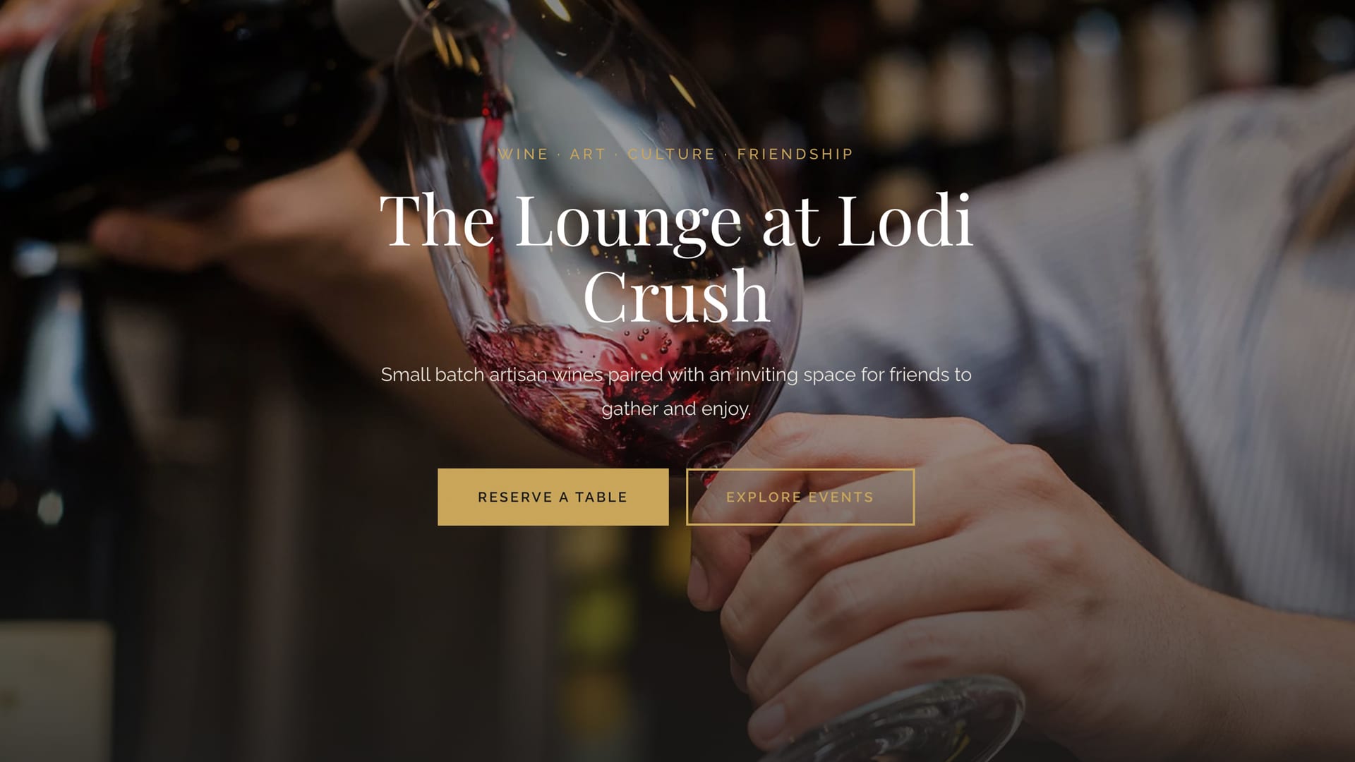
The Lounge at Lodi Crush home page: a glass of red wine being poured, with the headline "The Lounge at Lodi Crush" and buttons to reserve a table and explore events.
01

Problem

The Lounge at Lodi Crush pairs small-batch artisan wines with a space for friends to gather. The website has to make a visitor want to come in, then make it easy to reserve a table or join.

02

Role

I led the design and layout and made every decision on both, then built the site in code.

03

Process

A mood the site had to hold

I designed every section from scratch. The look is dark and cinematic, with gold accents, editorial serif type, and real photos of the space.

Hours and membership

I separated hours from membership to give membership a more premium feel, which suits this kind of business.
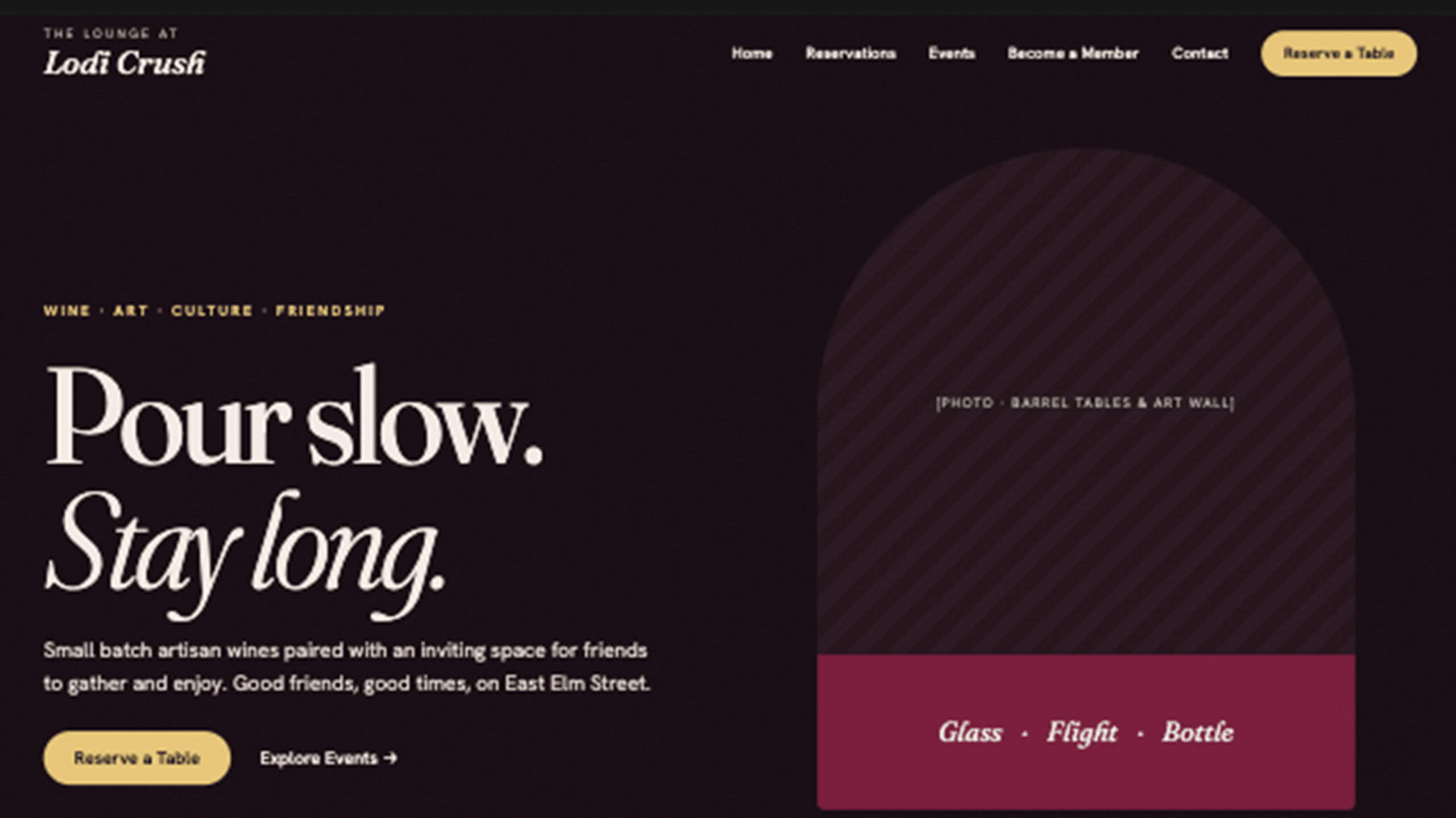
An early home page comp for The Lounge at Lodi Crush on a dark background. A navigation bar has Home, Reservations, Events, Become a Member, Contact, and a gold Reserve a Table button. The headline reads Pour slow. Stay long. with a line about small batch artisan wines, a Reserve a Table button, and an Explore Events link. On the right, an arch-shaped panel holds a placeholder labeled Photo, barrel tables and art wall, above a wine-red band reading Glass, Flight, Bottle.
Early direction: a dark home page with the headline "Pour slow. Stay long." and a photo placeholder
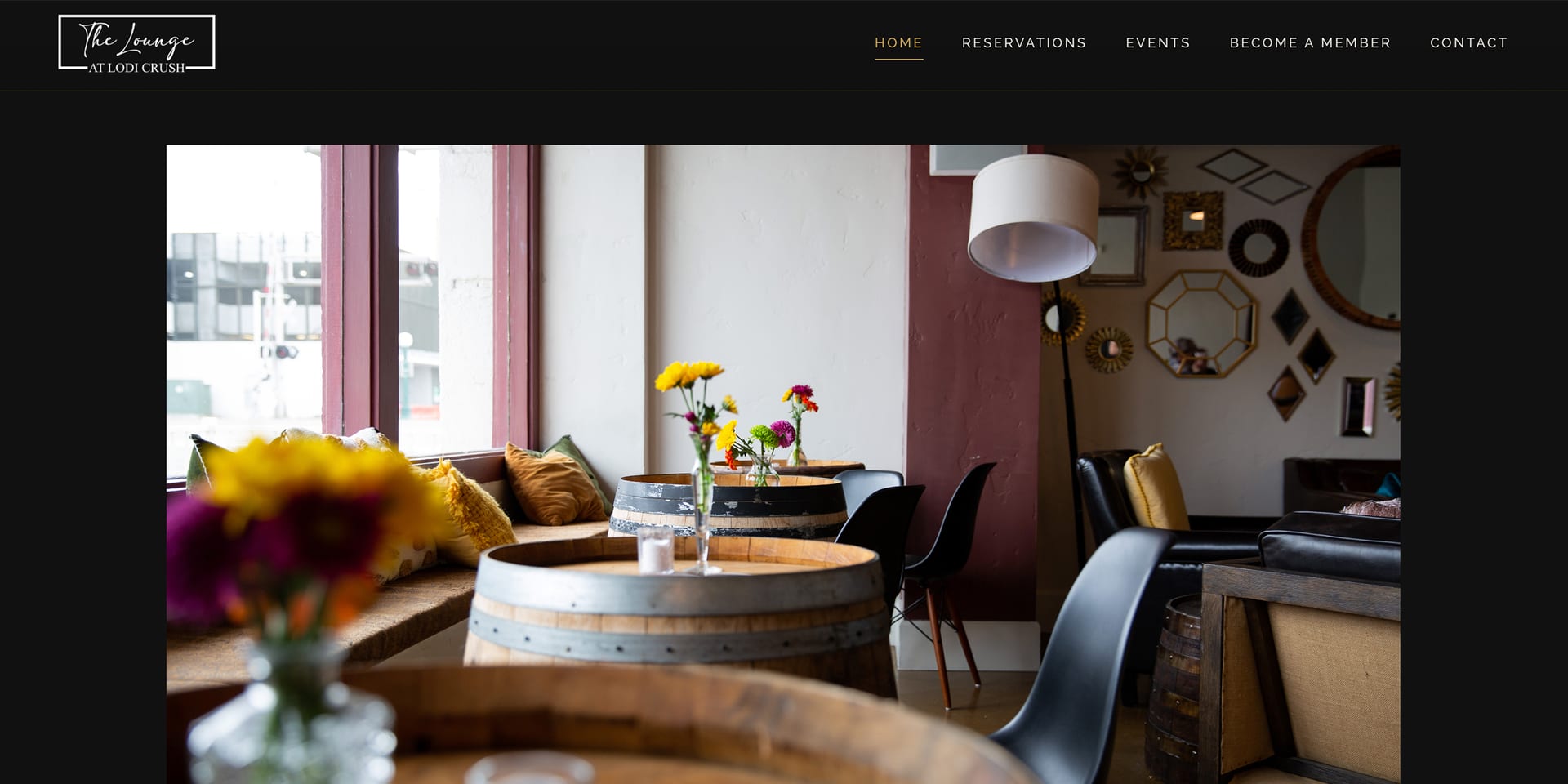
The final home page of The Lounge at Lodi Crush. A dark header has the lounge logo on the left and Home, Reservations, Events, Become a Member, and Contact on the right. Below it, a photo of the lounge interior shows wine barrel tables with fresh flowers, a window seat with cushions, black chairs, and a wall of mirrors.
Final home page: a dark header, and a photo of the lounge with its barrel tables
04

Solution

The site puts the room first with a full-width photo, a short line about the lounge, and two actions: reserve a table or explore events. Below it, two blocks answer the practical questions.
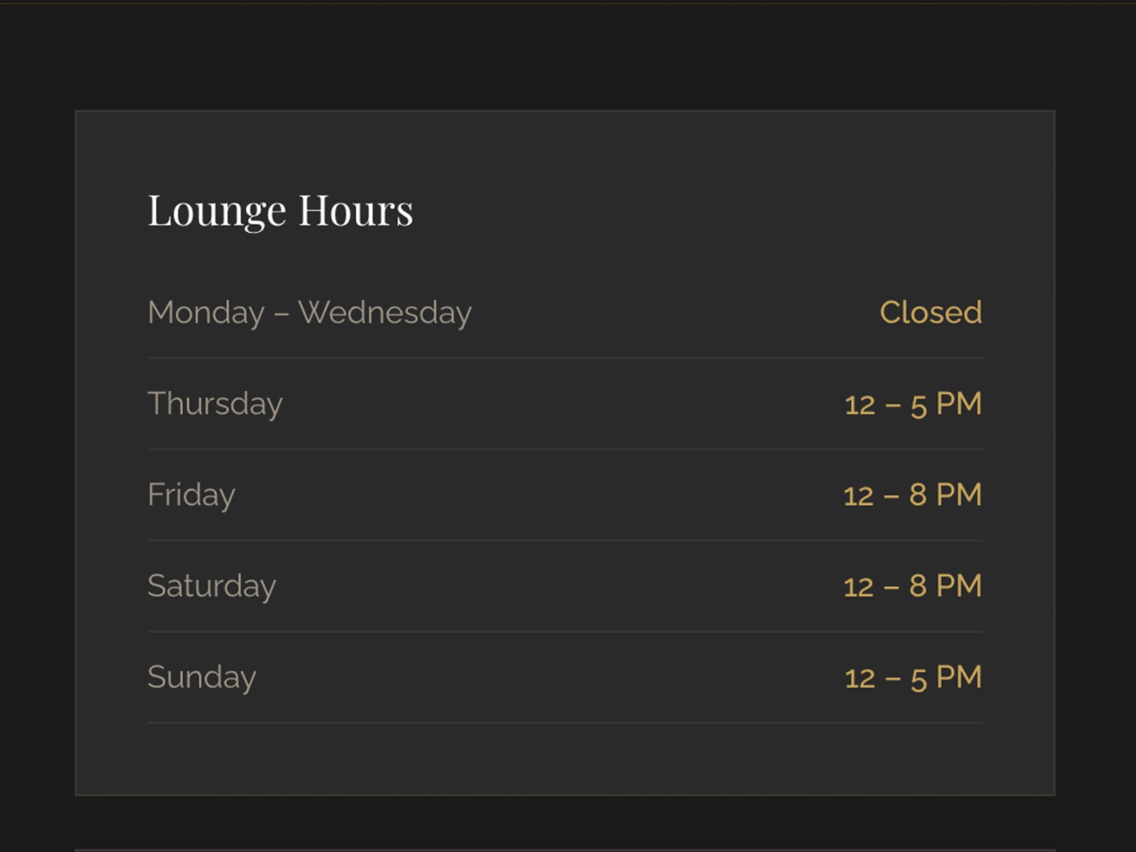
Lounge hours card: closed Monday to Wednesday; Thursday 12 to 5 PM; Friday and Saturday 12 to 8 PM; Sunday 12 to 5 PM.
Hours: closed Monday to Wednesday, open Thursday to Sunday.
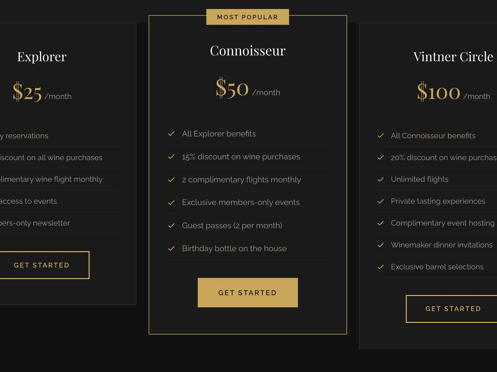
Membership pricing: Explorer at $25 a month, Connoisseur at $50 a month marked most popular, and Vintner Circle at $100 a month, each with a list of benefits and a Get Started button.
Three tiers, with the middle one marked "Most popular".
05

Outcome

The site now does three things VinSuite could not: online reservations, membership enrollment, and an architecture ready for POS integration.

06

What I'd change

The website matches the brand and the target audience, so there is not much I would change.